Network Analysis with Gephi and Anglo-Saxons

Exercise:
Analyzing historical networks is cool, but getting network data for historians is hard. So try your hand immediately at network analysis with this data set of 2,500+ Anglo-Saxons! This is a tutorial in using one of the most popular free network analysis programs available, Gephi. We will be exploring the basics of analyzing any historical (or other) network. This exercise uses data I gathered earlier in an exercise using Python. But, you don’t need programming or any previous skills to follow this tutorial!
Historical Sources:
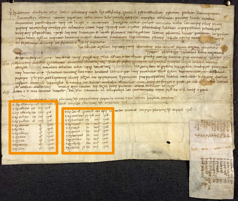
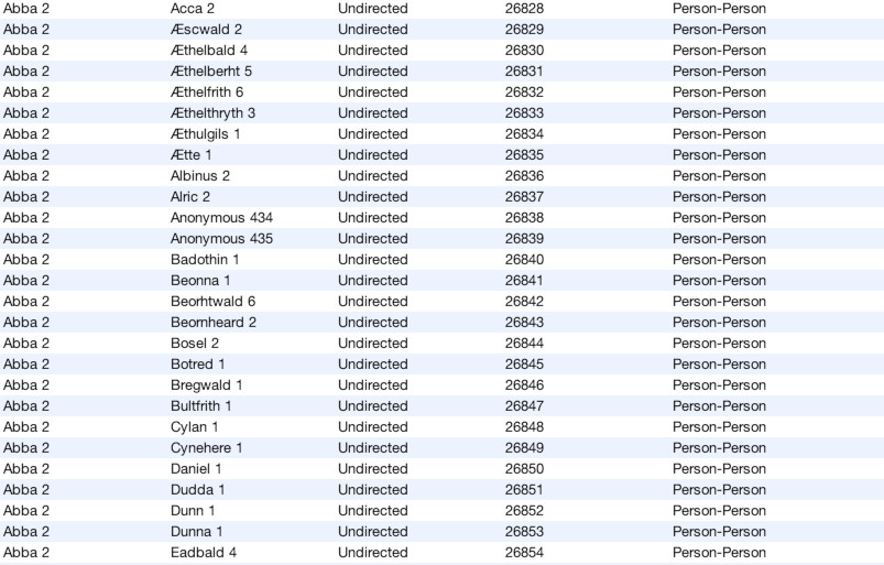
Our information comes from a database of nearly 500 charters from Anglo-Saxon England, c. 600-900 and over 2,500 people who appear on them. Charters were elaborate documents containing grants of land, property, et.c. that always have a number of important witnesses which helped guarantee its legitimacy. It is the list of these witnesses that I used to reconstruct a network of relationships between individuals. These charters, in aggregate, contain a wealth of information about reciprocity, relationships, and social display among medieval elites.
Data Source:
Using Python in the previous exercise, I extracted information from two related databases, The Anglo-Saxon Charters and The Prosopography of Anglo-Saxon England databases. By perusing the webpages for each charter and following links to the prosopography database I was create new data files containing the names of the peoples and charters, and the links between them (see below for download). The only information I recorded was the names of the people and which charters they were in. I did not extract direct metadata (such as the full texts of the charters) or personal information about the people, leaving only derived data.
Set Up:
First, head to Gephi.org and download the latest version (0.9.3 at the time of this writing). For Windows, double click the installation file and follow the directions, for OSX, open the .dmg file and drag the Gephi icon into your ‘Applications’ folder.
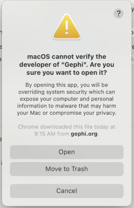
OSX USERS: You will get a warning the first time you try to launch Gephi. It will look like this…
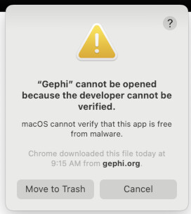
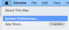
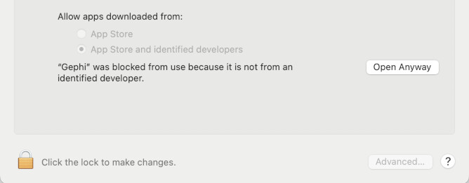
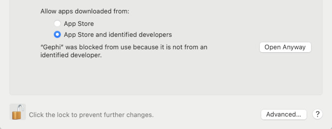
To fix it, first go to your System Preferences (1). Now open your “Security & Privacy” settings, it’s often the last setting in the first major group of settings, as seen in the bottom-right of the picture below (2) . With Security settings open, we first need to “unlock” the settings to make changes. To do this, click the padlock symbol in the lower-left of the panel, just left of where it says “Click the lock to make changes.” When prompted, enter your password to unlock changes (3). Now, to the right of where it says “‘Gephi’ was blocked from use because it is not from an identified developer.” Click “Open Anyway” (4). Once you do, you will see something very similar to the warning you saw before…. except this time there is a new option “Open”. Go ahead and click “Open” to launch Gephi. In the future, it should launch normally with no warnings (5).
Data Download
All networks are made up of two things, usually termed “nodes” (or “vertices”) and “edges”. Nodes are the “things” of a network… e.g. people in a network of friends and the edges are the relationships. Different programs expect different formats for saving nodes and edges, but I already prepared two data sheets ready for import into Gephi. They are both formatted as .csv files, a common type of plain text spread sheet. Download them below.
Nodes: asc_charters_and_people_nodes.csv
Edges: asc_charters_and_people_edges.csv
Network Theory
Beyond the technical angle, the intellectual theory behind network analysis is vast and far too sprawling to be covered in any real detail (beyond what we need to get by) in this tutorial. For a more thorough breakdown check out this great post by Scott Weingart on “Demystifying Networks“. For an extensive dive, check out the article by Painter, Daniels, and Jost, “Network Analysis for the Digital Humanities: Principles, Problems, Extensions.” To get us started though, here are 6 key terms….
Nodes: As mentioned above, nodes are the “actors” of a network, the subject of the study. In social network analysis these are people but in other kinds of network analysis can represent anything from computers in a network to intersections in a traffic grid.
Edges: Edges define the relationships between the nodes. They inform ‘how’ the nodes know one another. In an analysis of online exchange the nodes might be people and the edges represents messages sent from one user to another user.
Directed vrs. Undirected Graphs: In a directed graph, edges have “direction” (to and from) it matters. In an undirected they don’t (or rather, are two-way). Whether or not a graph is directed or not impacts the statistics as it effects the routes calculated between nodes. An undirected graph might, for example, be a network of friends, as the friendship is mutual and reciprocal. But, you might choose to analyze a network of letters sent by people as directed, as there is a definite “to” and “from” direction in the relationship. Our graph will be undirected, since people are only connected by happening to appear in the same document.
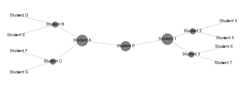
Betweenness Centrality: An extremely powerful measure (but only one of many!) of which are the most “important” nodes on a network. It is surprising how often this is a useful metric. Betweenness centrality is determined by first calculating (as if it were Google Maps) the shortest paths between every node on a network and every other node on the network. The betweenness centrality of any given node is a measure of how often these trips (going from other nodes to other nodes) had to pass THROUGH a given node in order to reach their destination. If we think of a traffic network as nodes of intersections with edges of roads, the betweenness centrality of an intersection is a measure of how often the “short trips” would go through a given intersection. Or, imagine a network of friends from some Hollywood (read: unreal) John Hughes-esque movie about high school, where we have distinct social cliques of “goths”, “jocks”, “nerds”. A person with a high betweenness centrality would the individual(s) who form the rare bridges between these groups and thus can facilitate cooperation. In the example below, Students “A,” “O,” and “1,” all have the highest betweenness centrality as they form the bridge between groups.
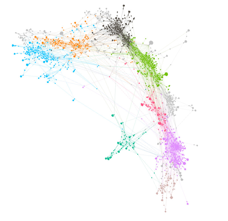
Modularity: A very slick mathematical way to detect larger “neighborhoods” in a network. It sifts out the structure of the network into detectable larger sections. For a brief but illustrative example, see below. Nodes are colored based upon which group the modularity algorithm sorted them into. For more info see here.
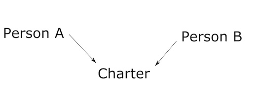
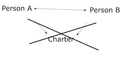
Multi-Modal Networks: Our starting network is a multi-modal network that we must transform. Multi-modal networks have more than one “kind” of node. True networks, in order to perform meaningful statistical analysis CANNOT be multi-modal. To put it simply, can’t have metaphorical apples with metaphorical oranges. An example… you might think of a network involving an exchange on Twitter. Someone new to network analysis might imagine that there are nodes that are “people”, and there are nodes that are “tweets”. And then they would draw edges connecting the people to the tweets they sent (or were mentioned in). But you see, this is a multi-modal network because it contains nodes of two wholly different types, people and tweets. A proper network (non multi-modal) would be a network of only people, with lines drawn between them when a tweet from one mentioned another person. Right now, our network is actually multi-modal. It contains connections going from Person -> Charter -> Person. We will use a tool in Gephi to take out the “middleman” (the charters) and leave only the connections between people.
There’s a lot more of course, but we don’t want to get buried any more than we are! That’s all the terminology we need to move onto the practical parts of the lesson.
Launching, Loading Plugins, and Importing
Open up Gephi from wherever you installed it and you should be taken to a loading screen similar to the one below. You won’t see the same filenames listed as in my picture below because you haven’t opened the program before.
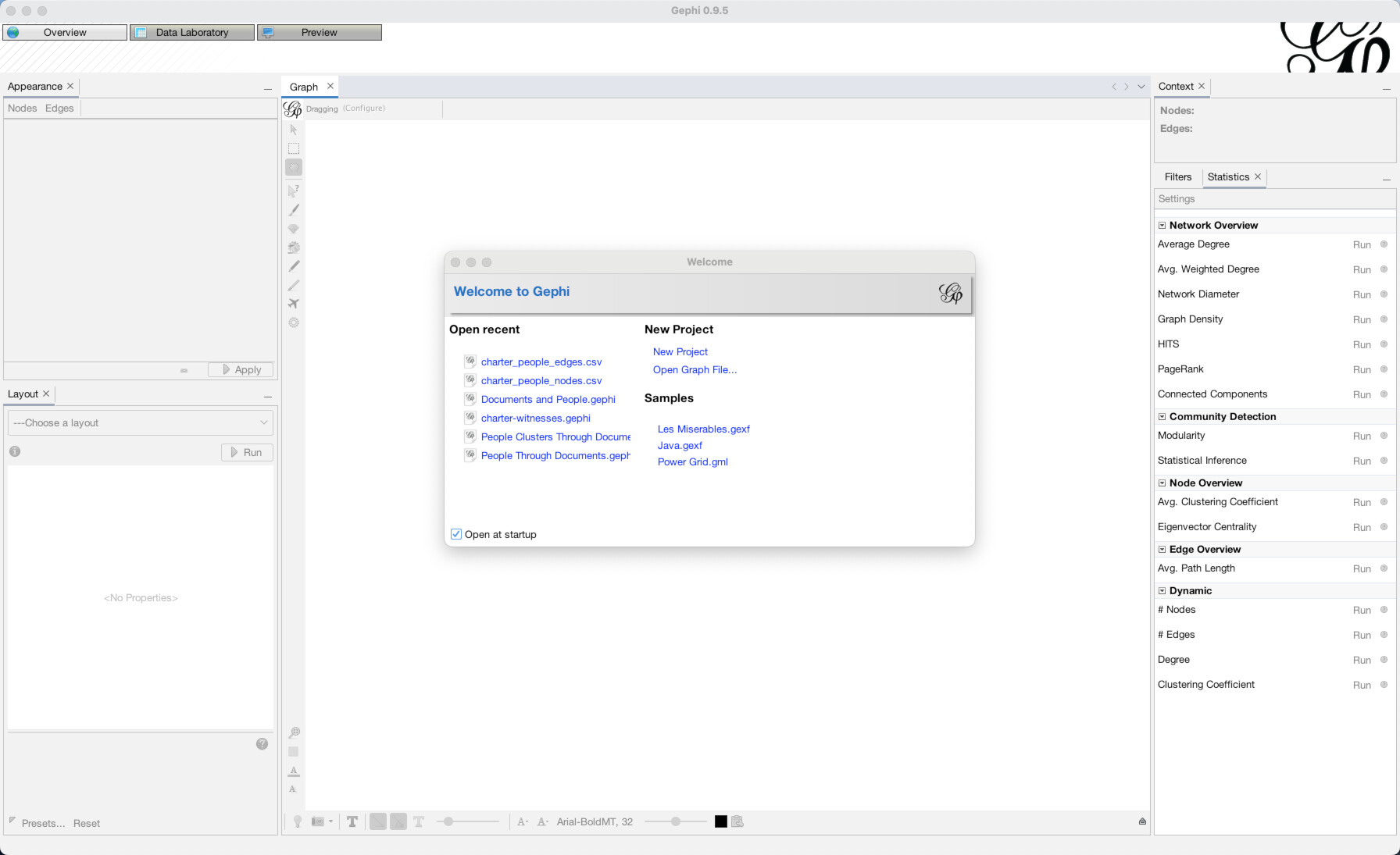
If you want, you can click to “Enable Timeline” at the bottom. Although I clicked it in some of our screenshots, we aren’t going to use it for this tutorial and so it doesn’t matter.
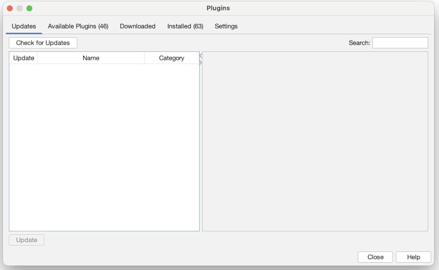
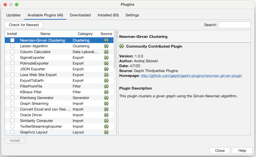
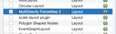
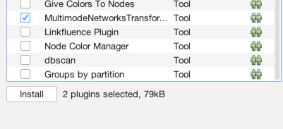
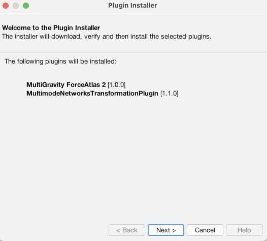
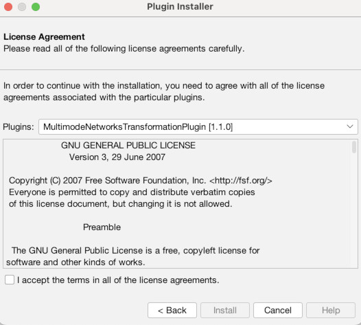
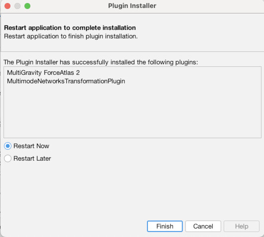
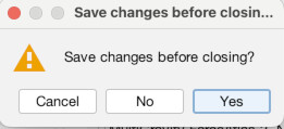
First though, we need to install a couple of plugins to do our work. To do that, go to the “Tools” menu and choose “Plugins” (1). Then click the tab that says “Available Plugins” (2). You should then see a list of all available plugins (3). There are many and I urge you to check some out, but we only need two for this exercise. Check the boxes for the “MultiGravity ForceAtlas 2” plugin (4) and the “MultiModalNetworks Transformation Tool” (5). Then click “Install.” Click “Next” to confirm (6). Then agree to the terms and conditions (7). Choose “Restart Now” to finish and relaunch Gephi (8). When it asks if you want to save changes, choose “No” (9).
Start up Gephi again and click “New Project” (1). Once it is loaded, notice the three buttons near the top left “Overview”, “Data Laboratory”, and “Preview”.
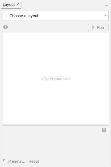
We are currently in the Overview mode, which gives us a real-time visual display of our current network. Our network is empty, so the overview is blank. Data Laboratory is where you go to see the underlying spreadsheets of nodes and edges that power the network. Preview is where you go to set up how you want a final rendered image of the network to look. For now, go to “Data Laboratory”.
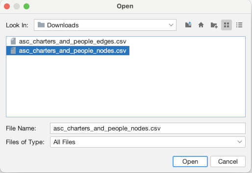
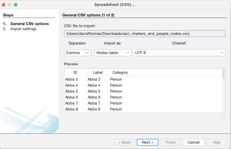
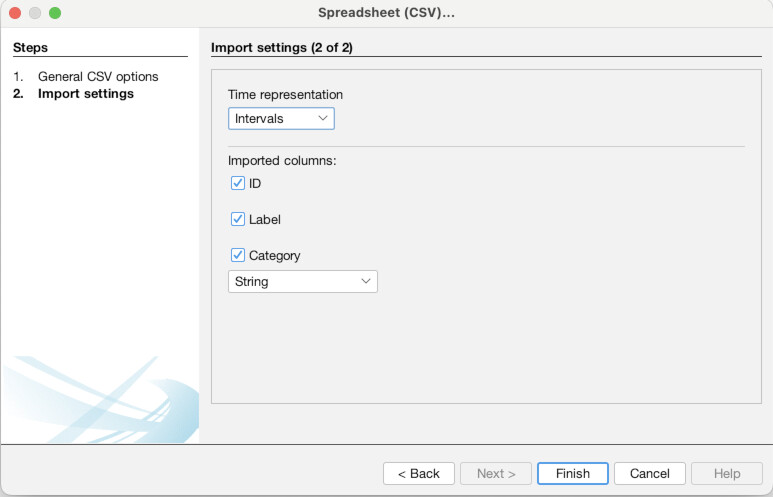
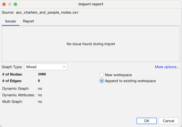
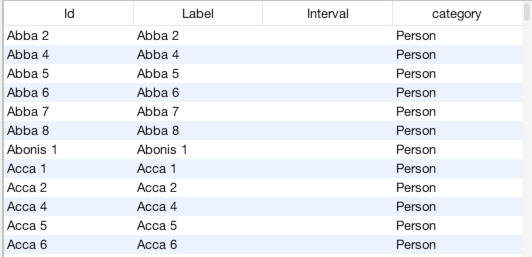
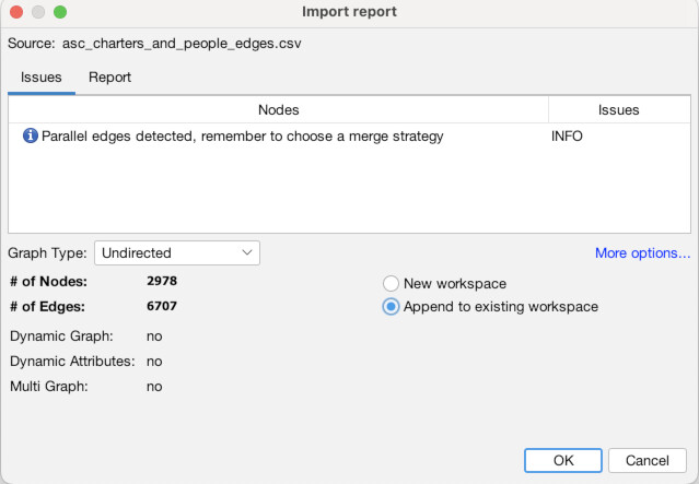
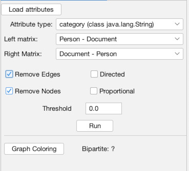
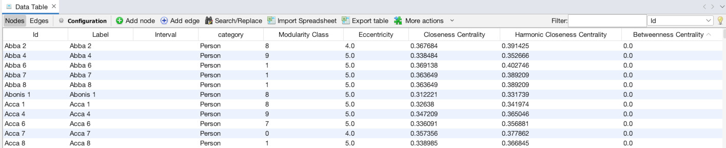
Once the Data Laboratory is open (1), note that there are two tabs, “Nodes” and “Edges”, just to the top-left of the empty spreadsheet, below where it says “Data Table”. We are currently set to nodes, but this is how you switch back and forth. Click “Import Spreadsheet” on the toolbar just above the empty spreadsheet. You will then see a file selection interface, navigate to where you downloaded the data files above and select the nodes file “asc_charters_and_people_nodes.csv” (2). It will then try to detect some basic information about the file, all of which appears correct, so hit “Next” (3). Then, it will ask you to confirm that it has interpreted the data types of the different columns correctly, which it has, so again hit “Finish” (4). It will bring up one final confirmation screen, MAKE SURE to select “Append to existing workspace” instead of “New workspace.” Once you have done that click “OK” (5). You should then see the spreadsheet populated with data about our Anglo Saxons (6)!
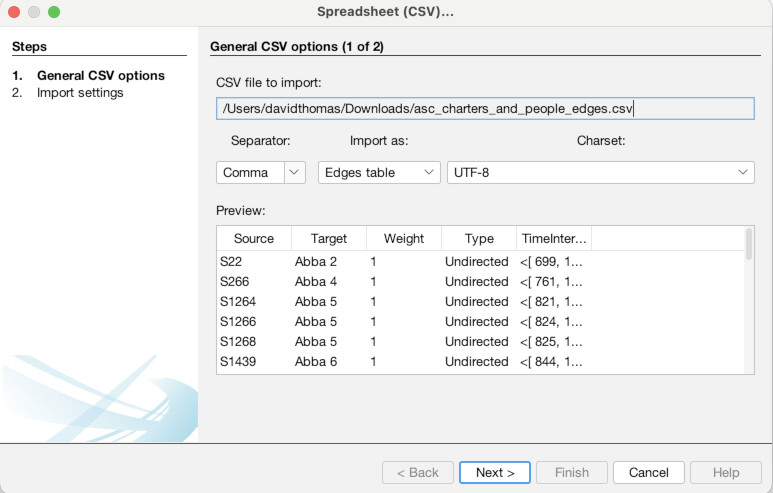
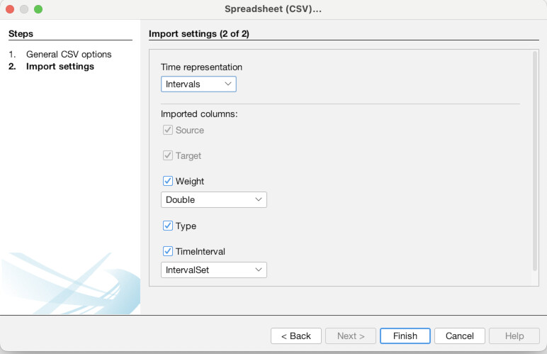
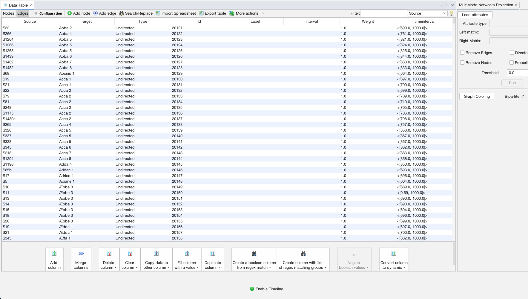
Now, we are going to do the same thing for the edges. Click the “Edges” tab at the top left (1). Again click “Import Spreadsheet” and this time select the edges file “asc_charters_and_people_edges.csv” (2). The details still look good so click “Next” (3), and again click “Finish” when everything looks right for the column types (4). When you get to the last screen, again, YOU MUST select “Append to existing workspace”. If you don’t, your edges will end up in a different place than your nodes! Finally, click “Okay” (5). You should then see a full table of edge data (6).

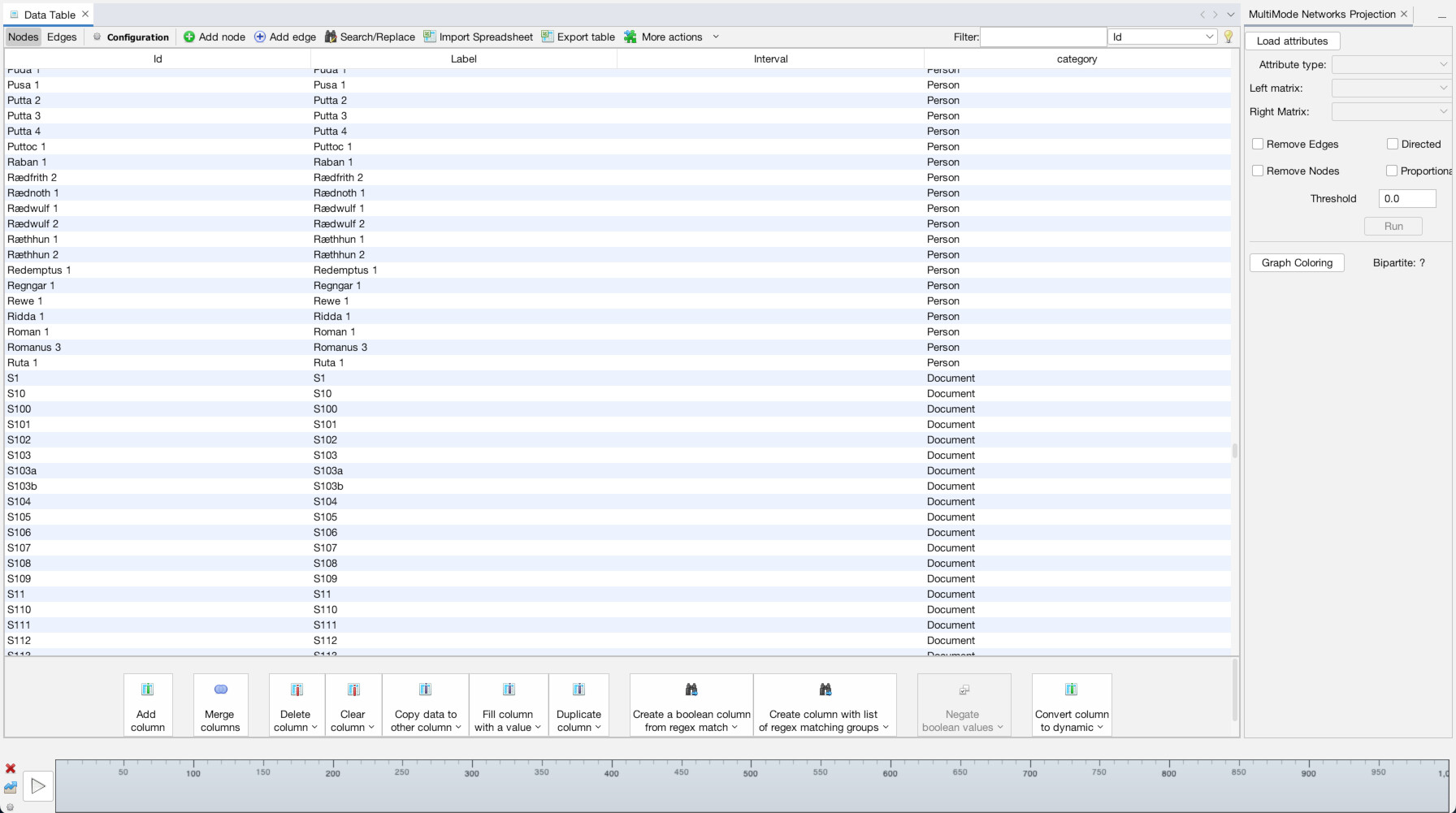
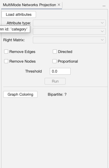
Now click back to your nodes tab. If you click on the header of the “Category” column you can sort the results by category. Click it again to reverse sort. If you do, you will see that we have nodes of two different categories, people and charters. Thankfully, I added this column when generating the data which will allow us to sort and transform this from a multi-modal network. If I didn’t, this would be impossible to perform.
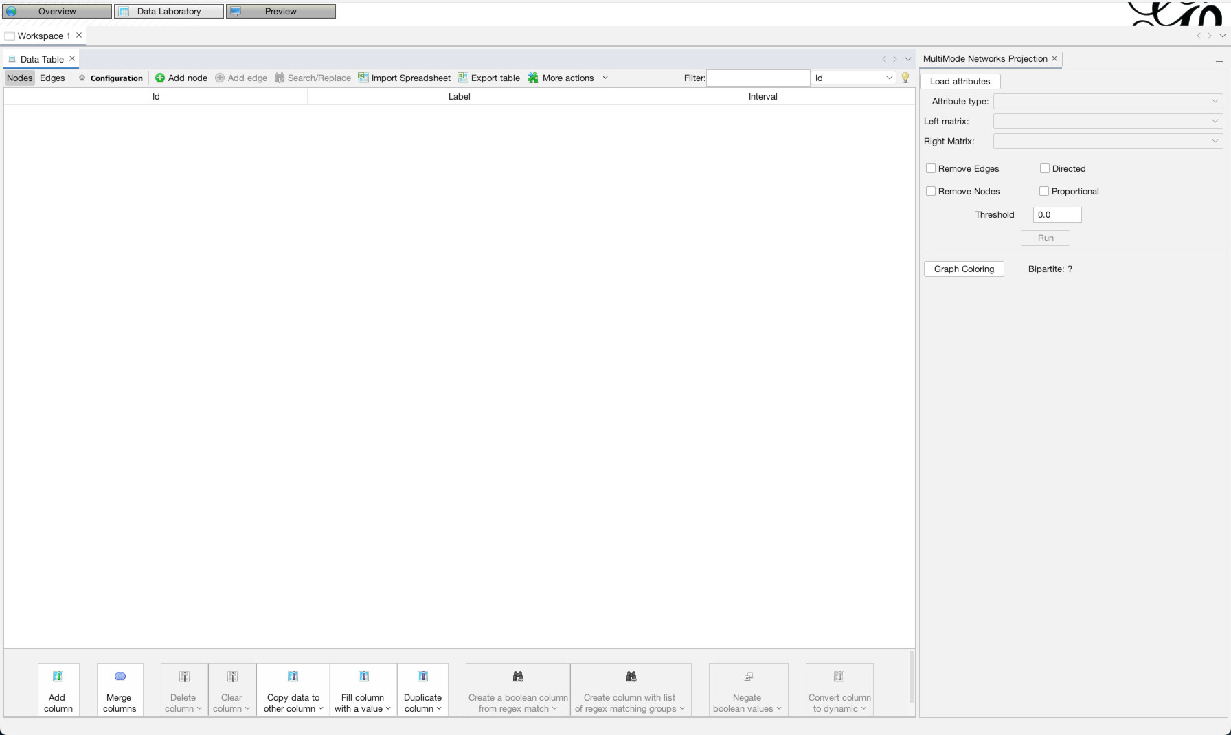
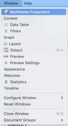
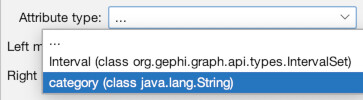
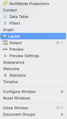
Now, the MultiMode Networks tool may already be visible (as it is in the top-right of the image above). But if it isn’t, you can access it any time (along with other tools), by going to the “Window” menu and choosing “MultiMode Projections” (1). Once the tool appears, you must click the “Load attributes” button for it to read the data columns (2). Now, we want to point it to that “category” column, so under the dropdown menu for “Attribute type” select “category (class java.lang.String)” (3). Now what we want is to transform the network from a configuration where people are connected to charters (4). Instead, we want to eliminate the charters and connect through straight from person to person (5). So, in the tool, under Left Matrix choose “Person – Document” and under Right Matrix choose “Document-Person”. Make sure “Remove Nodes” and “Remove Edges” are highlighted, then hit “Run” (6). Once you run it, you should be left with a network of only people (7). If you click over to the “Edges” data tab, you will see that the edges have all be changed to run from person to person (8).
With that, our network is loaded in, transformed, and ready for analysis. Let’s get to the fun stuff! Now, click back to the “Overview” tab in the top left.
Visualizing with Network Statistics
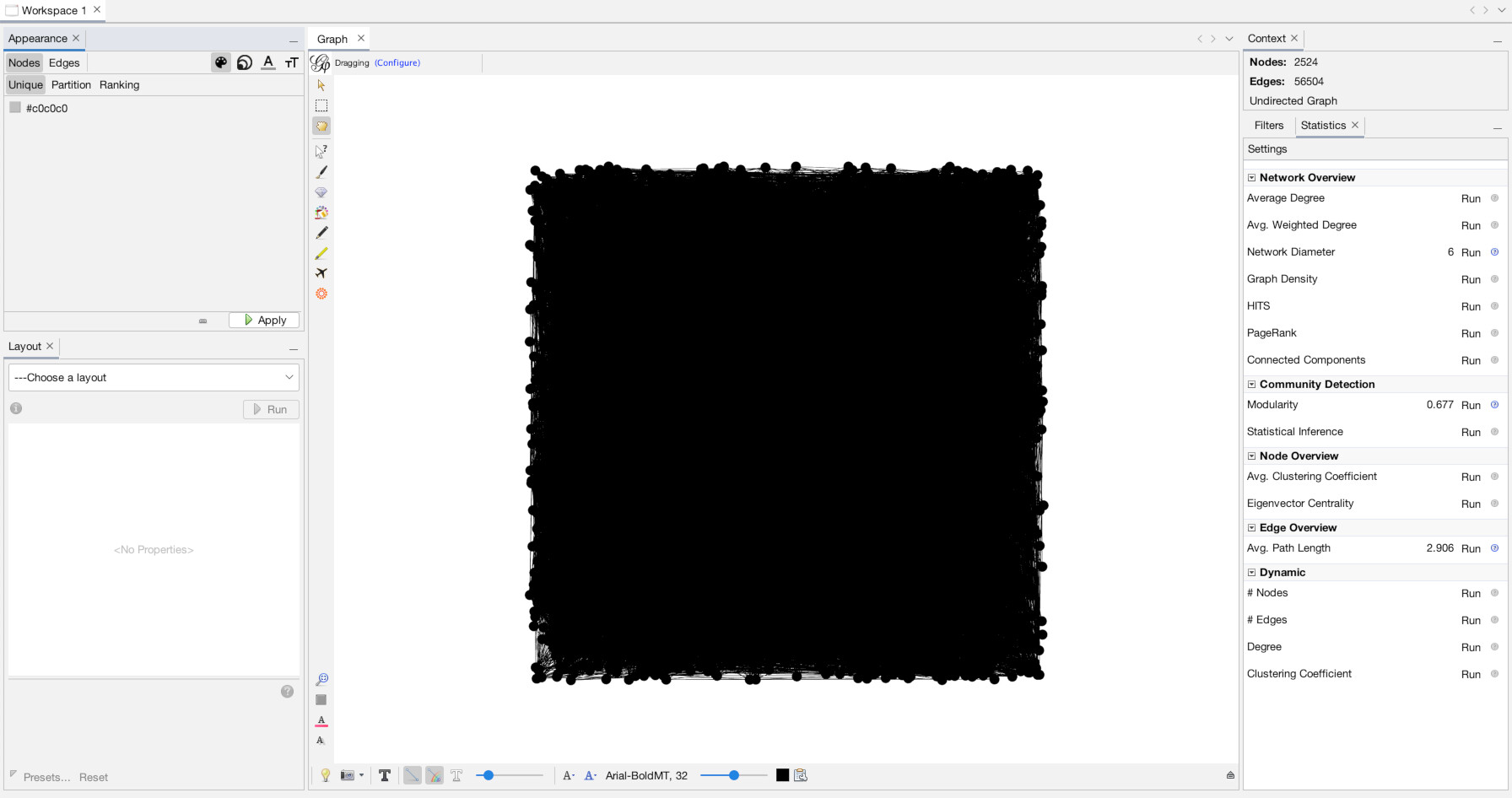
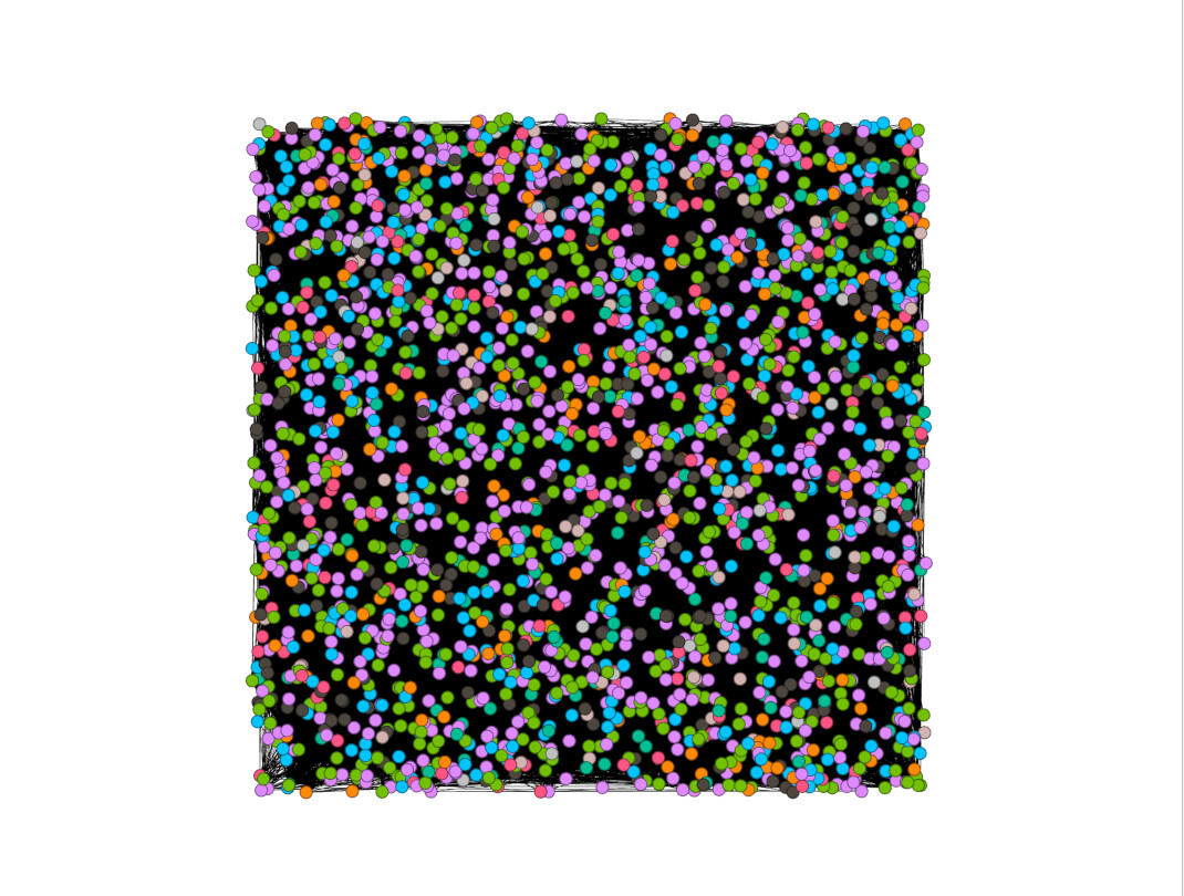
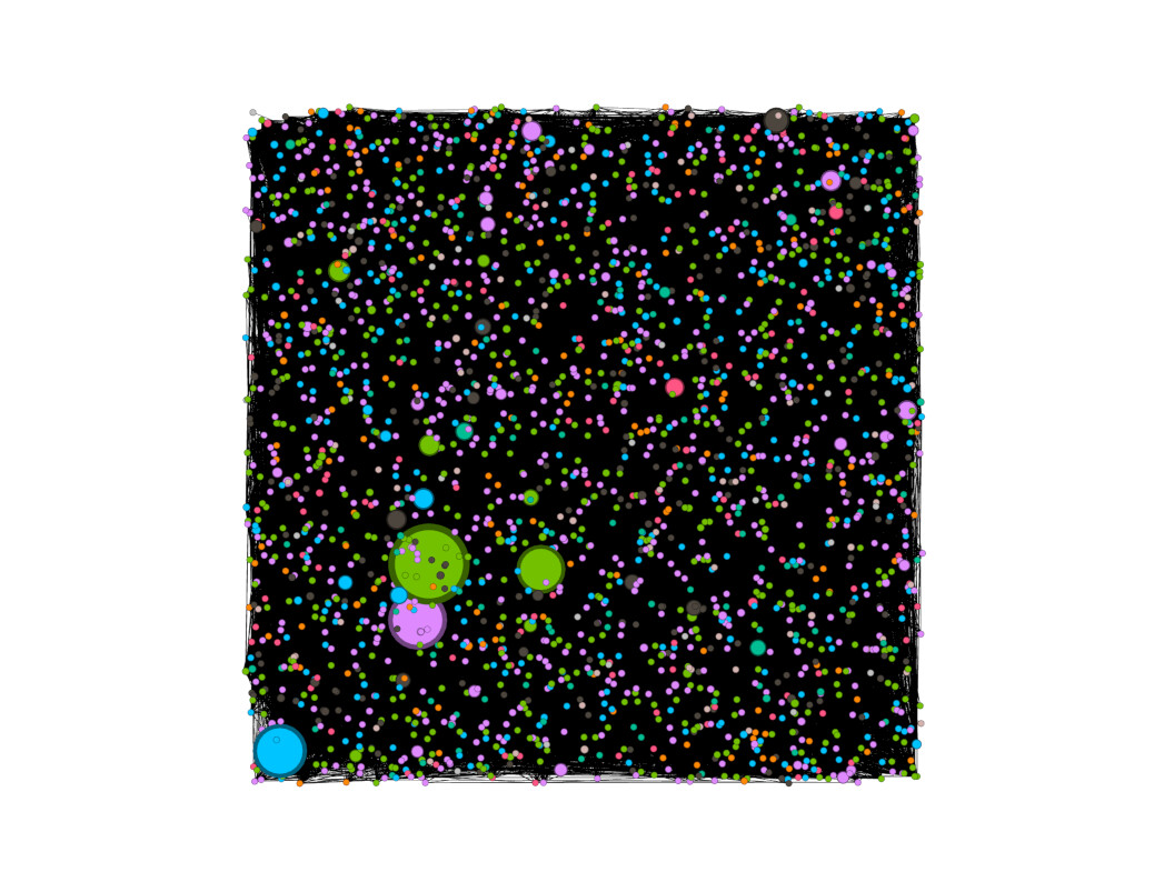
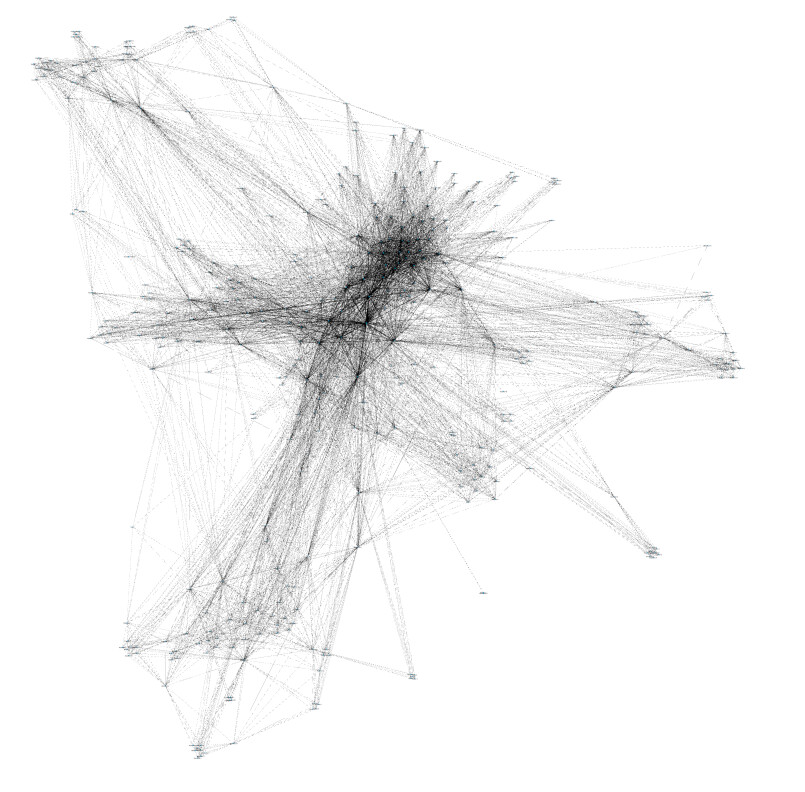
Once you have clicked the “Overview” tab you will see our network looks like…. oh no, a big hairy mess!
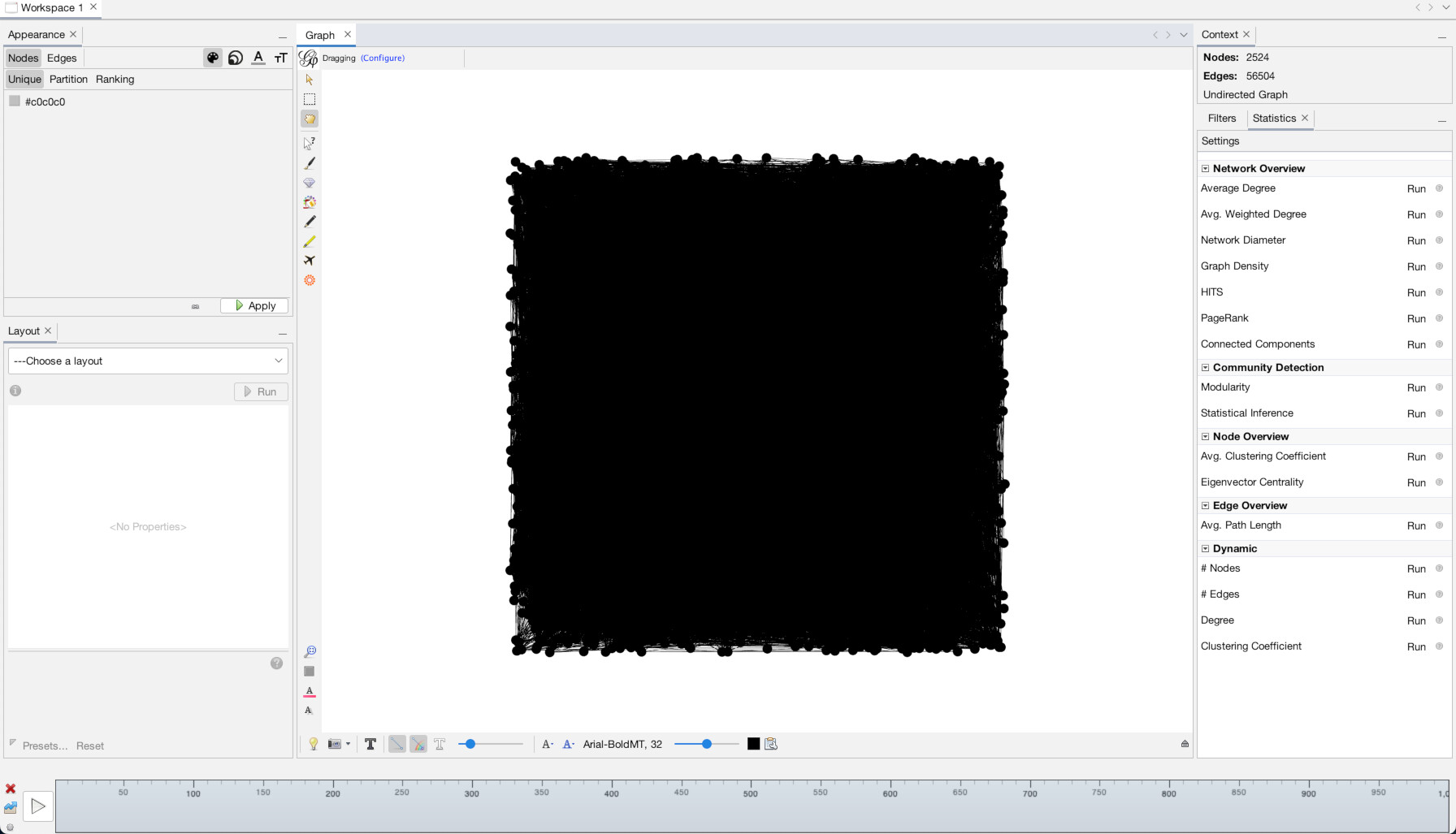
This is because, although we have loaded our data in, we have given it no instructions as to the placement, size, or coloration of the nodes. So it has placed every node randomly within a grid and then drawn the zillions of lines connecting them, giving them this mess.
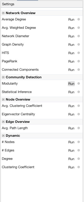
To bring clarity to this, we can easily change three things, the layout of the nodes, the color of the nodes/edges, and the sizes of the nodes/edges. We will use a layout algorithm to set the layout, but to give nodes information for color and size, we want to run network statistics. Network statistics is where much of the power of Gephi comes into play. The statistics panel performs multiple calculations on all the nodes/edges in your network, and then adds the results as new data columns in the “Data Laboratory” panel. From there, you can export that information for use elsewhere, or, as we will do, use it to power our network visualization.
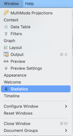
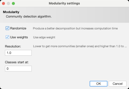
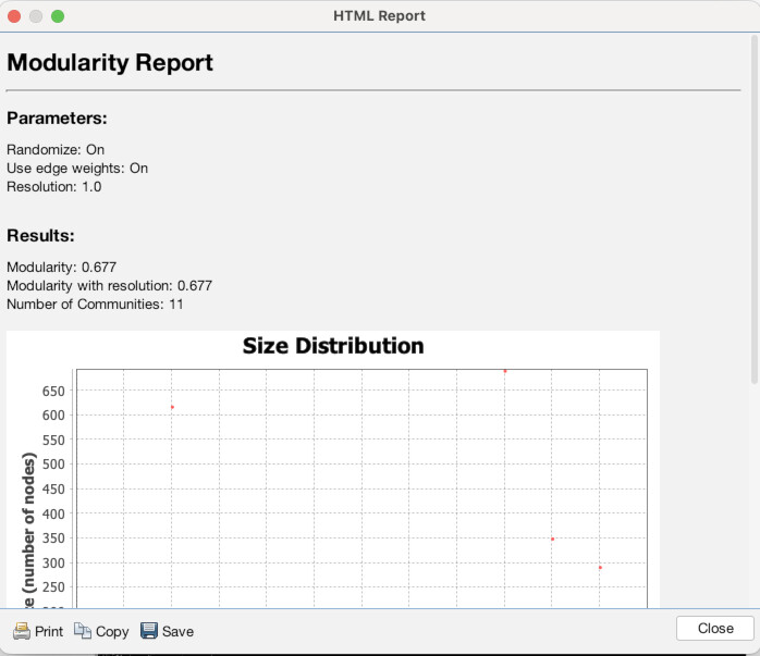
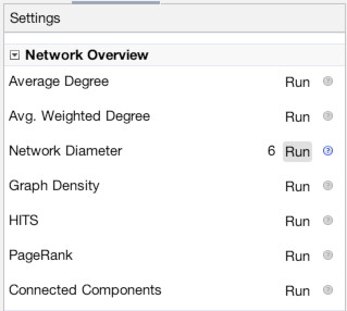
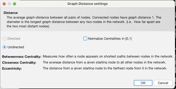
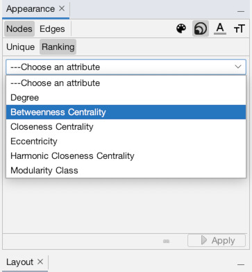
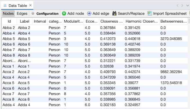
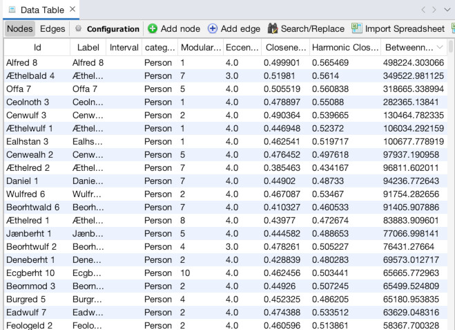
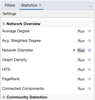
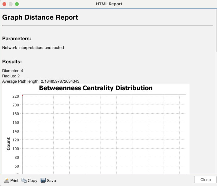
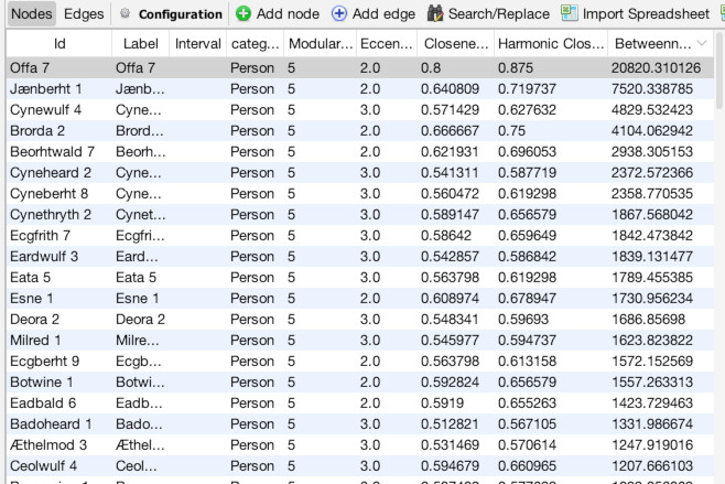
Once in the Overview panel, the statistics tool is likely already visible on the right side of the screen (as seen above). If it isn’t, or you need it later, you can access it by going to the “Window” menu and choosing “Statistics” (1). That will bring up a detailed view of the tool. The first statistic we want to run is “Modularity”, which we will use to set color. Click the “Run” button next to “Modularity” (2). Use the default settings and click “OK” (3). You will see an immediate readout that gives an overall summary of results, although it’s generally only of limited use (4). We will get to using the full power of the results in a minute. Next, run the “Network Diameter” statistic (5). Again, leave the settings as they are and click “OK” (6) and note: it will take awhile to run (7). When it is done and you click out of the report, if you navigate to the “Data Laboratory” tab and make sure you are on the “Nodes” tab, you will see that there are now new columns with entries for Modularity Class, Eccentricity, Harmonic Centrality, Closeness Centrality, and Betweenness Centrality (8). These will power our visualization.
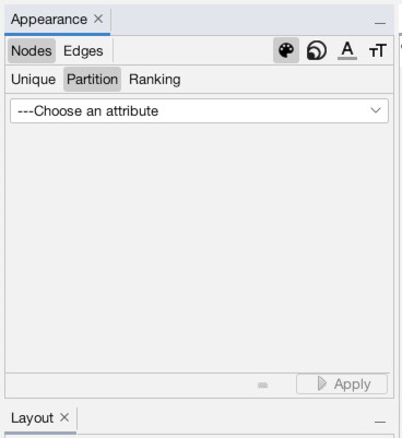
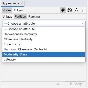
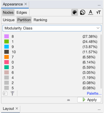
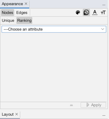
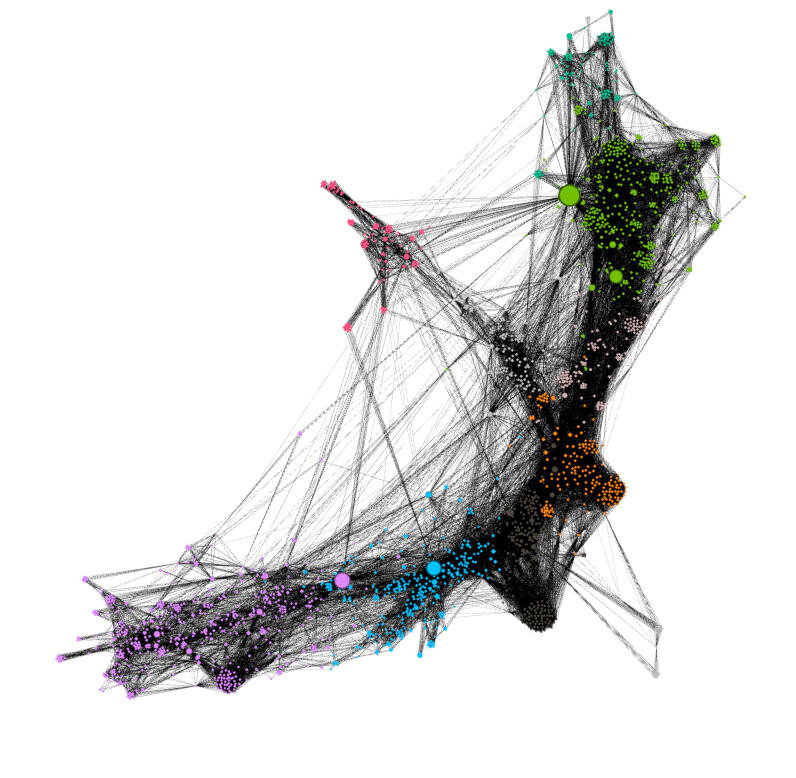
Now, let’s put those numbers to use! Navigate back to the Overview panel. In the top-left, you will see a box titled “Appearance,” under which are two sub-tabs “Nodes” and “Edges” and under that it says “Unique,” “Partition,” and “Ranking” (1). This is where we tell Gephi which visuals should connect with what data points. Note that to the right of where it says “Nodes” and “Edges” there is a symbol of an artist palette (this is to set color). There is also an image of multiple different-sized circles (this is to set size). The other icons are to set label size and color. Make sure that the artist palette (for color) is selected. Click on “Partition” (2). If we wanted to color our nodes on a gradient scale we would use “Ranking”, but since we want to split our nodes into different color groups based on a column, we will use “Partition”. Choose “Modularity Class” as the column that governs partition (3). As you can see, modularity has split the nodes into roughly a dozen groups and this has assigned them all random colors (yours will vary from mine)… click “Apply” to perform the operation (4). You should see the results instantly (5).
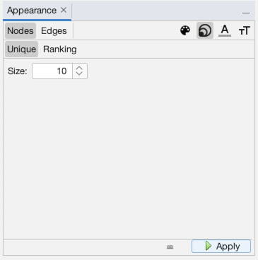
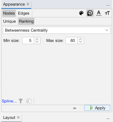
Now, let’s add size into the mix. Click the icon with multiple sized-circles to bring up the node size settings (1). Then, click the “Ranking” subtab which will allow us to set the size by column (2). Choose the “Betweenness Centrality” column to make the most “important” (or at least, central) individuals larger (3). Set minimum size to 5 and maximum to 60, or use other settings you prefer, then hit “Apply” (4). You should now see that some nodes are of a much larger size than others (5).
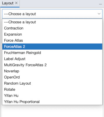
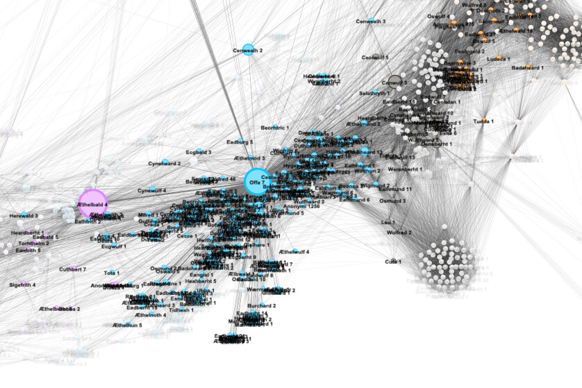
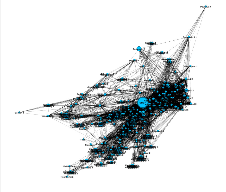
Now, it’s time to bring order to chaos and set the layout. There are many layouts for many different purposes, but we are going to use a type of “force-directed” graph known as ForceAtlas 2. The layout panel should be visible in the lower-left (1). If it isn’t, you can access it via the “Window” menu (2). Under the dropdown select “ForceAtlas 2.” The default settings are fine, so just hit “Run” (3). You will immediately see results. Wait a few seconds until it is mostly done moving before hitting “Stop” on the layout panel. Notice now you seem to be too zoomed-in (4). Use the mouse scroll to zoom in or out (or the magnifying glass tool) to get a better view of the entire network (5). Ah, there it is in all its beauty!
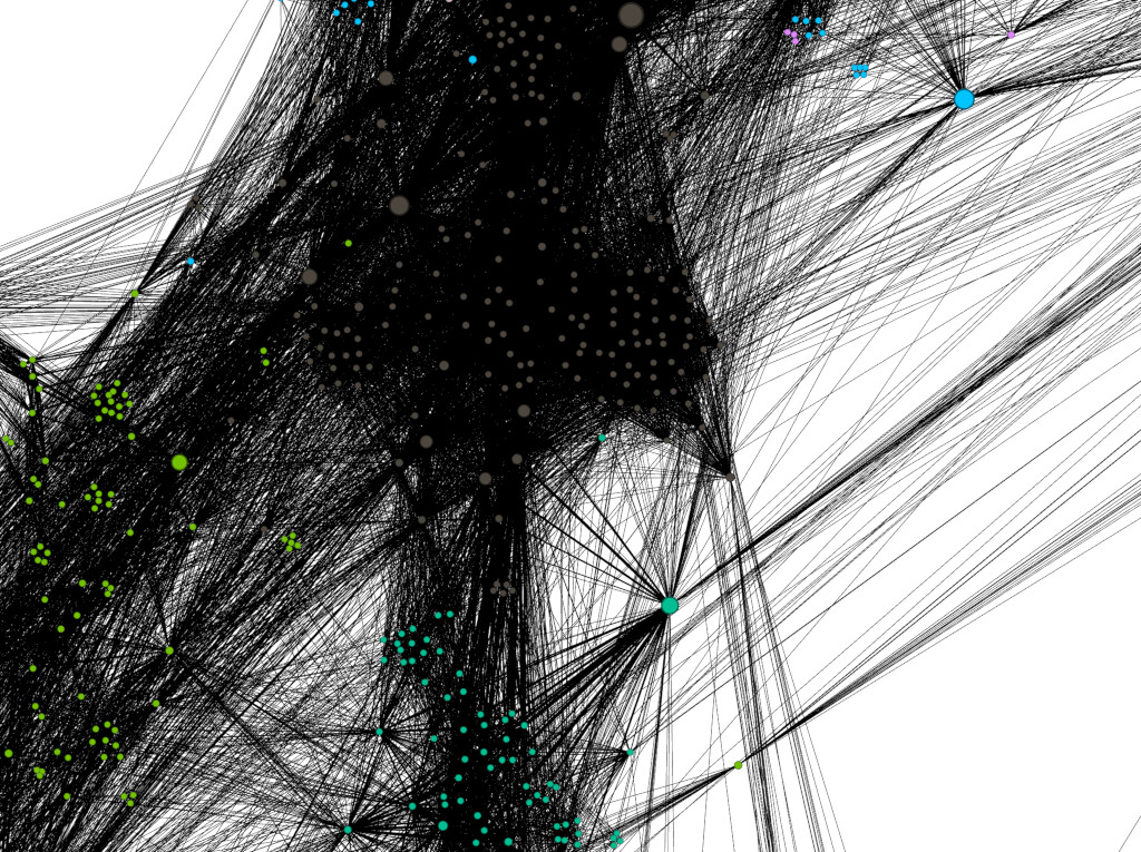
Note: the orientation and details of your graph (and colors) will look different (usually rotated), although largely similar. This is because there is an element of randomness in how the nodes all fall out.
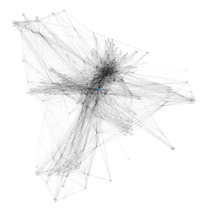
Wonderful, we can already learn some things. For example, we can tell straight away that everyone is part of one contiguous network. There are no clusters of people wholly separate from the main body. We can also easily see the most predominate “neighborhoods” via coloring by modularity class. But let’s find out more about the network. Note that there is one node that appears larger than the rest. On my example, it is found among the green nodes, though the color will likely vary for you.
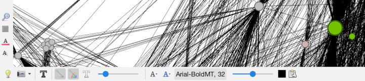
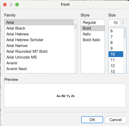
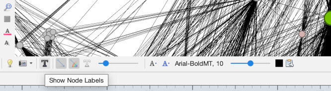
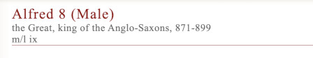
Zoom in on the individual node (1). Down at the bottom of the screen you will see buttons for setting the node labels in the Overview panel. Click the button that says “Arial-BoldMT, 32” to bring up font settings (2). Set the font size to 10 and click “OK” (3). Now, turn on node labels by toggling the button that looks like a shaded grey T on the bottom of the screen (4). You will see that his label is “Alfred 8” (5). If you go to the PASE database and look up the entry for Alfred 8, you will find that he was the famous Alfred the Great (6).
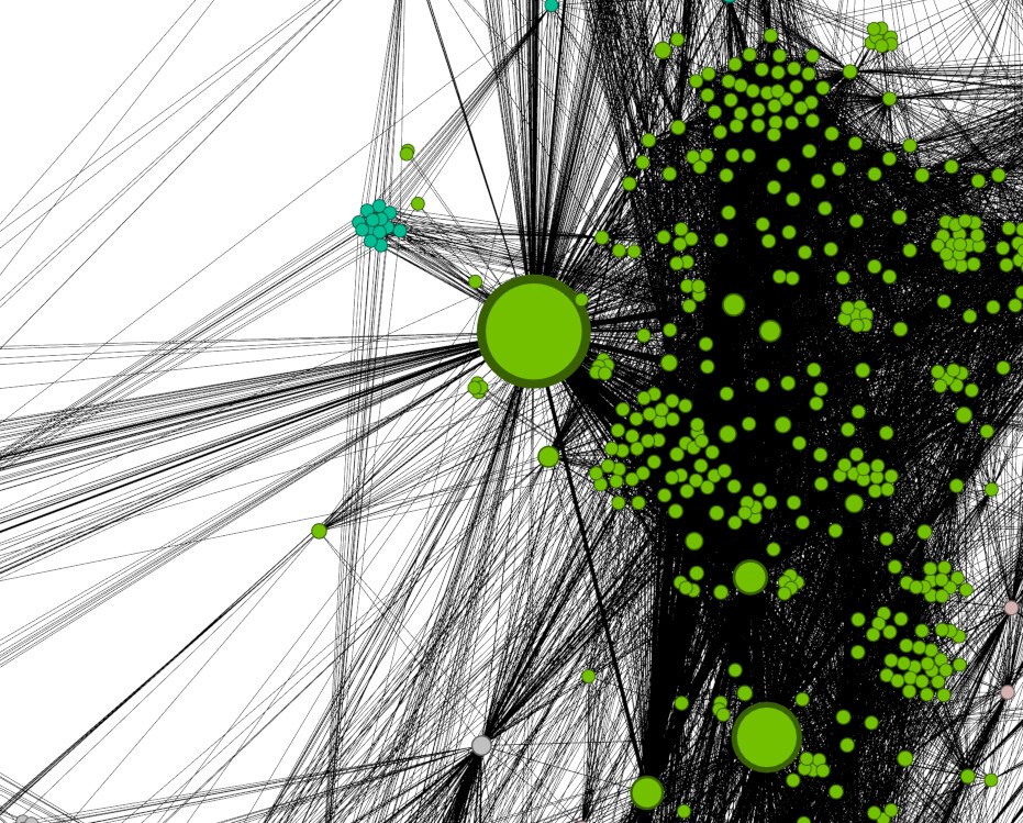
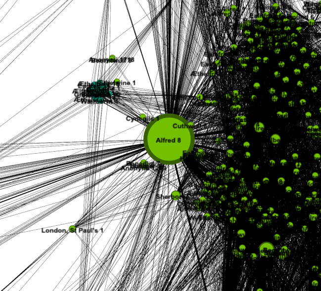
Kind of amazing when you think about it. Knowing nothing at all about these people beyond how they were connected in documents, network analysis was able to clearly point to Alfred being the most important person in the network. And if you think that it must be because, as king, he was in the greatest number of documents, but he was not. Alfred did not have particularly more appearances than other people, or more connections directly to other people. His influence is because he was indirectly important as a central hub in the network. As proof of concept that the method has merit for historical application this is fantastic. However, it hasn’t yet taught us anything we don’t already suspect.
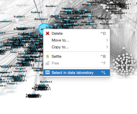
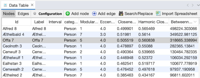
What might be interesting though, is information on who else is important. Click over to the “Data Laboratory” panel to see a list of all the nodes (1). Then, click the header of the “Betweenness Centrality” column so it sorts by Between Centrality. Make sure it is sorting in descending order, Alfred should be at the top (2). You can already see a list of other important people like Aethelbald 4. But what if you wanted to find out information from a node visually? Go back to the “Overview” panel and zoom in on the node for Offa 7 (3). Right-click on Offa and choose “Select in data laboratory” (4). Now, the next time you go to the laboratory, Offa will be highlighted (5).
Already we have a lot that a traditional historian could poke at here. With time ,we can suss out central figures, regional leaders, and more. But we can make our results more fine-grained by using filters.
Slicing and Dicing Networks: Filters
Filters allow you to temporarily hide parts of your network, essentially turning them on or off. This allows you to see relationships within subsections of the network. For example, hiding a bunch of nodes will change the betweenness centrality of the rest of the nodes on the network (once you recalculate it that is).
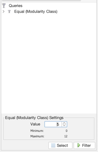
We are going to filter the network to only show one “neighborhood” (one modularity class). This will allow us to open up and see how scale affects the measure of our nodes. For this, we will be looking at just the “neighborhood” of Offa 7. In my example it assigned him to number “5”, but it might be different for you (in later screenshot the number changes to “8” when I rerecorded part of the tutorial). To check Offa’s modularity number, go to the Data Laboratory, find Offa 7, and look under the Modularity Class column.
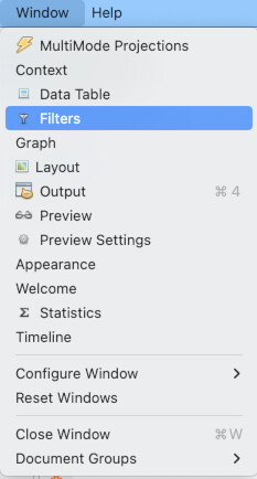
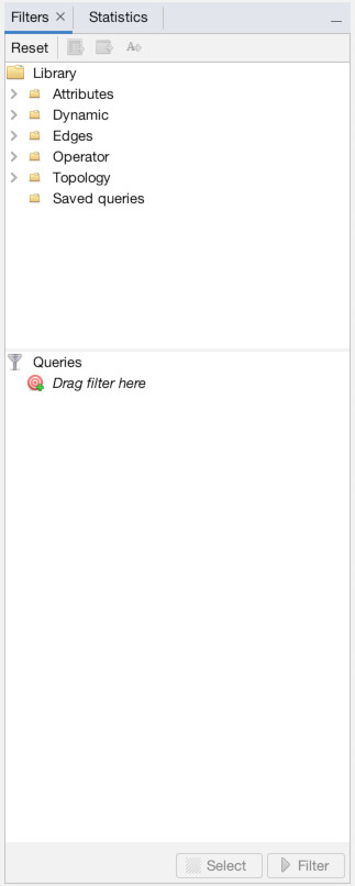
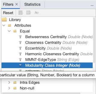
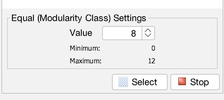
To access filters, go to the “Window” menu and choose “filters” (1). It normally can be found right where the statistics panel is, and a tab toggles back and forth between statistics and filters (2). Now, we are going to filter out based on an attribute (modularity class) so click the dropdown button next to “Attributes”. We want to make the attribute equal to a value so click the dropdown next to “Equal”, and finally select “Modularity Class” (3). Now drag that “Modularity Class” from the menu down below where it says “Drag filter here…” (4). Finally, enter Offa 7’s modularity class (in my case 5, but check to make sure for you) and hit filter (5). You should instantly see updated results with only Offa’s neighborhood remaining (6).
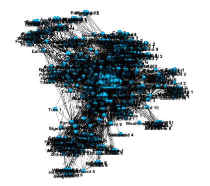
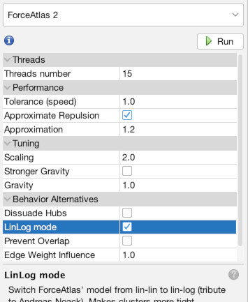
Now, let’s rerun layout and statistics to reflect a view of just this neighborhood. If you go to the layout panel and “Run” ForceAtlas2 again you will see our results are a little cramped (1). There are several ways to deal with this, but one easy fix is to turn on LinLong mode under the layout options (2). You should see the nodes space out quite a bit (3). Now rerun Network diameter (4) and get the results (5). You can choose to resize the nodes based upon new betweenness centrality if you want (6). If you go to the data laboratory you can see the new centralities (7). To turn off the filter, return to Overview and select the “Stop” button in the filter panel (8).
Note that Offa’s betweenness centrality is still the highest, but it is not as high. This is because some of his importance came from acting as a bridge to those outside the neighborhood. In Alfred the Great’s neighborhood this effect is far more pronounced. If you filter out other neighborhoods, Alfred the Great becomes just the SIXTH most important. What can this tell us? That Alfred’s influence came more from his exogenous connections (those going outside the community) than his endogenous connections (those within the local neighborhood). That is to say, Alfred power was less locally rooted than Offa’s.
This is just a taste of the kind of insights possible. A medieval specialist could do much more with this than I. But I hope you are beginning to see the analytical possibilities. Next, we will move to preparing a final publishable graphic of your network.
Final Product: Previewing Results
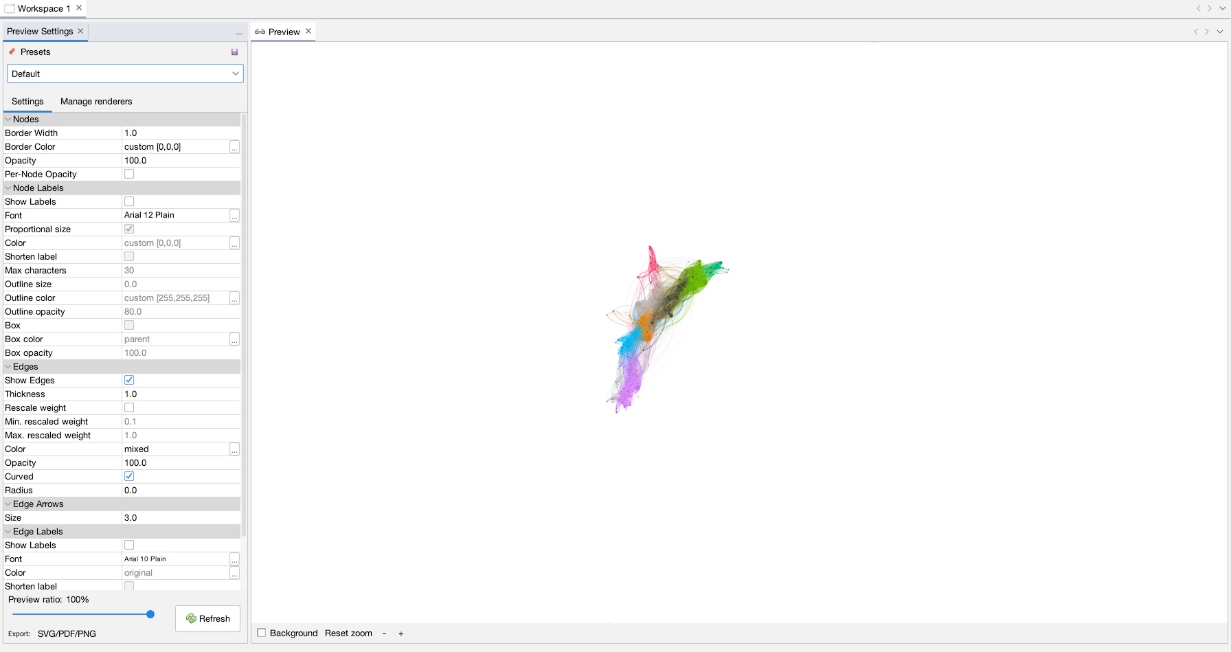
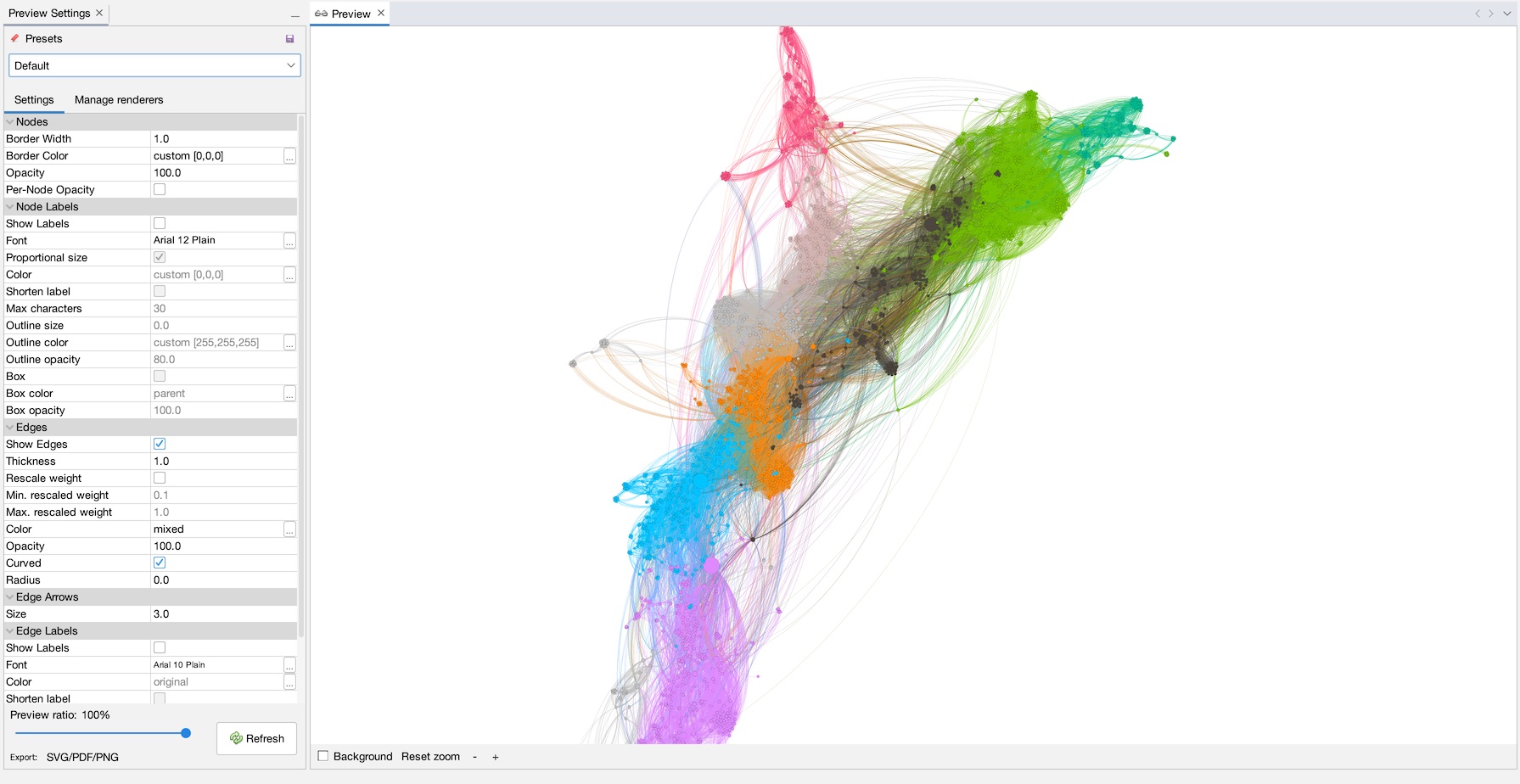
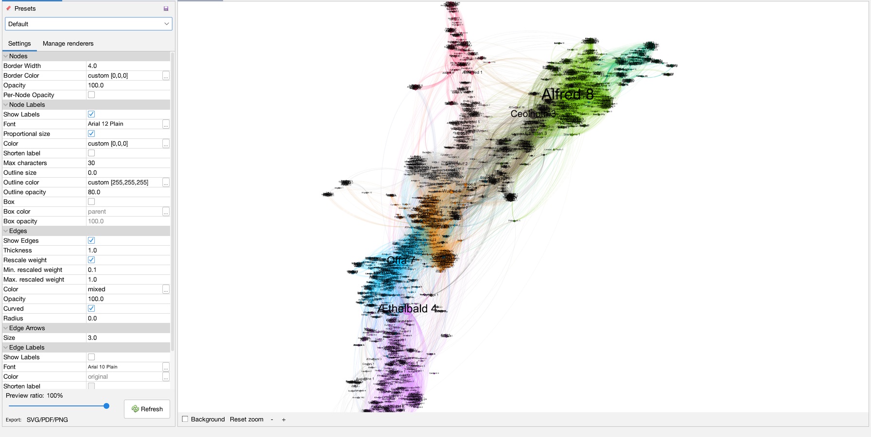
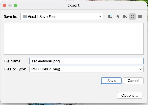
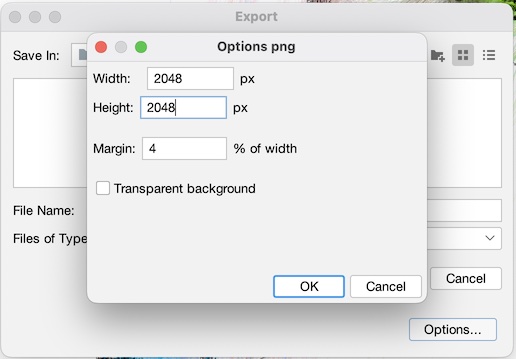
Now, let’s make a purdy picture! Go to the “Preview” tab (1), and when it comes up click “Refresh” (2) to see a render of the network with the default settings (3). Use the mouse-wheel or the ‘+’ and ‘-‘ buttons to zoom into the network a little (4). On the left, under “Node Labels”, click “Show Labels”, and make sure “Proportional size” is selected. Hit refresh to see the results (5). You can change whatever settings you like, when you are ready, hit “Export SVG/PDF/PNG”. Choose PNG as filetype and name it whatever you want (6). Note that there are advanced settings where you can increase the resolution of the final image to make it bigger (7). Click save, and you are done!

And that’s really about it for the basics! Congratulate yourself, you just got through a mountain! But you at least have a nice final product as result.
If you want to see more about how I got the data in the first place using Python (warning, not for beginners), see my post here.
In general, it is not easy to get network data for historians that you do not make yourself. I don’t recommend using Gephi to generate network data. Better to use Excel or something else and then import the data afterwards into Gephi.
There are loads of different network analysis tools out there, some lightweight ones are Palladio and NodeXL. Another serious competitor to Gephi in the sciences is Cytoscape. For a general background to network analysis in history and humanities, I highly recommend the chapters on network analysis in Exploring Big Historical Data: The Historian’s Macroscope.
Happy history hacking!